Evaluation Metrics for Ads Ranking Systems
Ads ranking systems are the barebone of many modern business and became one of the main success story of machine learning applied to real-world problems. Given an user/client, the main goal of such ranking systems is to order a set of candidates ads according to their click or conversion score. As such it is commonly modelled as a binary classification task where the positive class (\(y^+\)) represents clicks or conversions, and the negative class (\(y^-\)) represents examples without interaction. In the most common case, the adopted classifier is a probabilistic classifier, which does not provide a class label, but rather the predicted probability of the positive class \(\mathbf{P}( y = y^+)\). According to the application, it is possible to obtain a predicted label by applying a threshold \(t\) to \(\mathbf{P}( y = y^+)\):
\[ \hat{y} = \begin{cases} 1 & \text{if} ~ \mathbf{P}( y = y^+) \geq t \\ 0 & \text{o.w.} \end{cases} \]
In most classification problem a reasonable threshold is \(t=0.5\). However, in many domains the datasets are not balanced, models are not perfectly calibrated, and different use-cases have different sensitivity vs specificity tradeoffs. For example, many real-world applications are dominated by negative examples; thus a more conservative classifier might be prefered. Conservative models produce positive classifications only with strong evidence; thus they are identified by a low False Positive Rate. Probabbilistic classifiers can be made more or less conservative by adjusting the threshold \(t\), and many experiments are required to detect the best trade-off. To this end, common evaliation metric that relay on the predicted labels, such as Accuracy or F1-score, are not suited in these domains as they fails to capture some important aspect of the model performance. To overcome this problem, it is desireable to have metric capable to identify model perforamnces based on the predicted probability rather than the predicted label and that are robust to unballanced datasets.
| Predicted condition | ||||
|
Total population P + N |
Positive PP |
Negative PN |
||
|
Positive P |
True positive hit TP |
False negative miss FN |
True positive rate Recall / sensitivity TPR = TP/P = 1 - FNR |
False negative rate miss rate FNR = FN/P = 1 - TPR |
|
Negative N |
False positive type I error / false alarm FP |
True negative correct rejection TN |
False positive rate probability of false alarm FPR = FP/N = 1 − TNR |
True negative rate specificity / selectivity TNR = TN/N = 1 − FPR |
|
Precision positive predictive value PR = TP |
Fale omission rate FOR = FN |
|||
Table 1: definition of all the metric reported and build on to of a Confusion matrix, credito to wikipedia
ROC-AUC
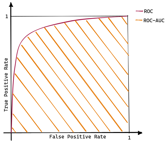
The Receiver Operating Characteristic (ROC) is an analysis tool initially proposed by Provost et al. to compare classifiers’ performance. The ROC curve is built as the interpolation between the False Positive Rate (FPR) on the x-axe, and the True Positive Rate (TPR) on the y-axe, computed at different thresholds. Intuitively, the TPR represents how well a classifier can identify all the positive examples. In contrast the FPR indicate how likely an error will occur in the negative class (for a formal definition of TPR and FPR, consult the confusion matrix reported in Tab. 1).

As shown in Figure 1, a model that have higher ROC cureve is deemed to have better performances. However, there is the need to summarise the knowledge captured by a ROC curve in a single scalar value to facilitate the comparison of different models. To this end, the area under the ROC curve is used as a summary statistic representative of the classifier performances. Thus, ROC-AUC is defined as:
\[ \text{ROC-AUC} = \int_0^1 TPR ~ \delta \small FPR. \]
Note that ROC-AUC exhibits the following properties [1]:
- It can be interpreted as “the probability that the scores given by a classifier will rank a randomly chosen positive instance higher than a randomly chosen negative one” [2] [3]. In other words, the ROC curve shows the ability of the classifier to rank the positive instances relativeto the negative instance only.
- A universal baseline is always available, as a random classifier will have ROC-AUC of 0.5.
- It cares about the ranking obtained from the predictions but does not consider the actual predicted value.
- A classifier do not need to produce accurate, calibrated probability estimates; it need only to produce relative accurate scores that serve to discriminate positive and negative instances [4].
- The perfect model is represented by the point \((0, 1)\) and has an AUC of 1.
- The point \((0, 0)\) identifies a model that never issues a positive prediction.
- The point \((1, 1)\) implements the opposite strategy: only positive predictions are made.
- ROC-AUC is a linear space, thus allowing for easy interpolation and visual interpretation.
Highly Imbalanced Dataset
In the general case, one of the most attractive properties of the ROC curve is its robustness to changes in the class distribution. This propertly derives from the fact that, ROC curves are defined as a ratios of quantities computed w.r.t. only the positive or only the negative class rather than a mix of the two. Thus, we expect a model to generate similar ROC curves regardless of the number of positive and negative examples present in the dataset. In so doing, ROC curves are a great tools to compare model across different datasets; for example dataset generated across different day.
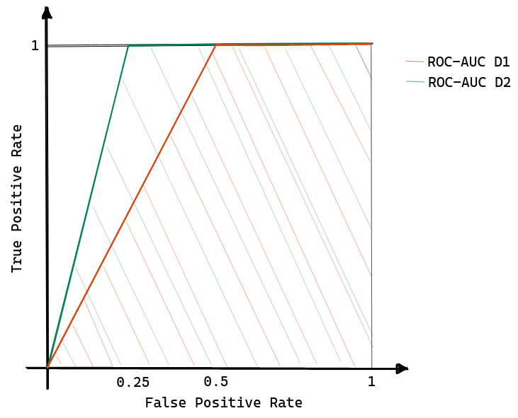
However, ROC curves are known to be “over-optimistic” at scoring model performances when the datasets are highly skewed, and there is a high interest in evaluating the model w.r.t. the positive class. For example, consider the case where you have two datasets; the former is composed of 100 negative points and 50 positive samples, while the latter is composed of 100 negative examples and 25 positive examples. As shown in Figure 2 (a) , let’s assume that the negative examples overlap with the positive ones according to a uniform distribution.


Let’s try to compute the AUC for both of the datasets:
- then for D1, as the threshold (\(t\)) moves from \(0\) to \(0.5\) the True Positive Rate remains constant at 1; instead for \(t > 0.5\), both TPR and FPR decrease linearly since positive and negative examples start to be homogeneously mixed.
- similarly, for D2, when \(0 \leq t \leq 0.75\) then \(TPR = 1\); while for \(t>0.75\) TRP and FPR decreases linearnly.
A graphical representation is provided in Figure 2 (b) showing how the ROC-AUC of the second dataset is more significant than the first dataset even if the models have the same maximum F1-score (maximum F1-score on D1 is achieved with \(t=0.5\) while on D2 the best threshold is \(t=0.5\)). A deeper analysis suggests that this over-estimation problem arises when a significant change in the false positive leads only to a slight shift in the false positive rate since the dataset is dominated by the negative class [5].
Precision-Recall curve
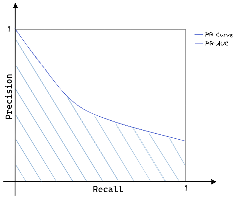
When the main objective is to evaluate a model on the positive class, PR-curves are more informative. Figure 3 shows how PR-curves are built by plotting the Precision as a function of the True Positive Rate (or Recall). By inspecting Tab. 1, it is visible how PR-curves effectively consider only statistics related to the positive class; thus, they are inherently robust to highly skewed datasets [6]. Perhaps motivated by the similarity with ROC-curves, PR-curves became a popular alternative to analysis models on highly skewed datasets.

As for ROC curves, the PR-AUC is defined as:
\[ \text{PR-AUC} = \int_0^1 PR ~ \delta \small TPR. \]
Overall, we can distinguish the following properties for the PR-AUC:
- PR-AUC has no intrinsic meaning except the geometric one.
- While ROC-AUC has a baseline value of \(0.5\), in PR-AUC there is no universal baseline to compare with.
- PR-AUC is not directly connected with the F1-score; thus is unrelated to the calibration score of the model.
- The perfect model is represented by the point \((1, 1)\) and has an area of 1.
- PR space is an hyperbolic space; thus more difficult to inspect visually and find similar performing models.
LogLoss
One of the limitations of the previous metrics is their focus on the ranking obtained from the model output, but they ignore the predicted value itself. This is not an issue in most recommendation systems, but most real-time ad allocation systems require well-calibrated and accurate prediction values to implement an optimal bidding strategy. In this problem instance, choosing a threshold t is not important. Rather there is high interest in having predictions that, on average, reliability resemble the ground-true. That is: “the probability associated with the predicted class label should reflect its ground truth correctness likelihood” [7]. For example, consider a dataset composed of 10 samples and assume that the model assigns a probability of 0.6 to every instance. Then, if the model is calibrated, we expect 6 examples to belong to the positive class.
Note that:
- Calibration is a measure of uncertainty, not accuracy.
- A calibrated model allows for higher interpretability as the output probabilities have an intrinsic meaning.
A standard metric used to monitor the model’s calibration is the negative LogLoss:
\[ \mathcal{L} = - \frac{1}{N} \sum_{i=1}^N \Big( y \log(\hat{p}) + (1 - y) \log(1 - \hat{p}) \Big); \]
where \(y\) represents the ground-true label, \(\hat{p}\) is the predicted probability, and \(N\) is the size of the dataset. The LogLoss has an extended application history as training loss for (deep) logistic regressions, yet here a claim is made to adopt it as a validation and test metric. Modern deep neural networks are highly accurate but overconfident, showing poor uncertainty estimation [8]. Thus, it is handy to have a scalar metric to summarise a model’s calbration characteristics and compare it to the prediction error.
Brier Score
Another popular method to capture the model calibration in a scalar value is by computing the Brier Score[9]:
\[ \mathcal{BS} = \frac{1}{N} \sum_{i=1}^N \Big( y_i - \hat{p}_i \Big)^2. \]
The Brier Score is the mean-squared-error between the ground ture and the predicted probabilities; thus the lower the value the better.